
CRIMES OF GRINDELWALD — FANTASTIC BEASTS TAKEOVER
Activating retail as entertainment space to fuel brand addiction
J.K. Rowling’s Wizarding World franchise is enormously successful with a built-in fan base, hungry for what’s next. We collaborated with AT&T and Warner Bros. to bring a bit of Hollywood magic to AT&T flagship stores. Every inch of the space was transformed to enhance key characters, scenes and storylines from the movie. We obsessed the consumer journey, analyzing the way consumers learn, interact, and build meaningful brand associations. Behavioral science is at the core of multiple entry-points for different types of consumer segments. During the activation, sales of Premium Video were up 14%, Postpaid Voice was up 10% and Broadband up 55%.

CAMPAIGN FOR FEMALE EDUCATION IDENTITY AUDIT & DESIGN
Creating alignment between brand position and identity to core mission
The Campaign for Female Education (CAMFED) is one of the world’s largest nonprofit organizations focused on girls’ education with incredible impact in villages across Sub-Saharan Africa. Since its inception in 1993, CAMFED has educated 2.6 million girls and improved learning environments for 5 million children. In the Fall of 2018, the Campaign for Female Education reached a 25-year landmark anniversary that would kick-off a year of celebration – with a focus on raising awareness and funds for the next chapter of the NGO. Twenty Four 7 conducted research into the awareness and understanding of “Camfed” as a name and logo identity. We found people were more likely to think “Camfed” had something to do with cameras, the federal government or feeding the hungry than serving as a global nonprofit focused on girls’ education. It was a classic example of an internal moniker or abbreviation being used for external audiences who were quick to dismiss it due to lack of awareness or understanding.
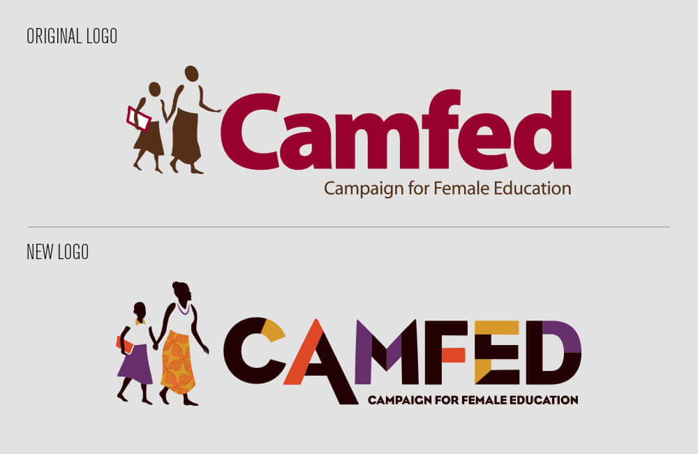
The Campaign for Female Education now precedes the shorthand of CAMFED – used in all-caps to denote an abbreviation. The logo bug, that was originally drawn in pencil on a napkin by the organization’s founder, was evolved to bring more human features to the figures of a young woman leading a girl to school. Typography, color, and patterns were obsessed to reflect the vibrant culture, landscape and energy of Africa.


JUSTICE LEAGUE MOVIE LAUNCH
Creating tangible VIP experiences
In an unprecedented partnership, AT&T and Warner Bros. collaborated to give fans what they want most: access to movie making magic. Costumes, props, storylines, actor interviews, one-of-a-kind content and interactive experiences were all part of the VIP experience – including the first ever public viewing of the Batmobile.

SEATTLE CREDIT UNION BRAND POSITIONING
Brand building in a competitive, ever-changing marketplace
From 2008 to 2018, Seattle was ranked the fastest growing big city of the decade. It had more cranes in the sky than any other U.S. city, fastest growing home prices in the country, the second most popular city for immigrants, and six-figure job openings – many with six-figure salaries. The landscape – both physical and figurative – was changing daily. In the midst of this boom, Seattle Metropolitan Credit Union began a brand audit that would change the trajectory of the company. Twenty Four 7 was tapped to augment research, synthesize data and outline a strategic plan. We weren’t given a tangible deliverable like a retail experience design, or brand framework, or roadmap for marketing – though we did all of those things. We were asked to re-think their position in the marketplace and light a path to success. What followed was a fruitful relationship between a group of entrepreneurs and a leadership team working to make a difference in the lives of all who call Seattle home. We changed everything from the name (now Seattle Credit Union) and logo identity, to a shift in branch design and operations, to storytelling, advertising and even product mix. Twenty Four 7 continues to partner with the city’s original credit union – Seattle’s partner in growth and prosperity.

AT&T Branded Experience Design
Inspiring the masses to discover a Connected Life
AT&T opened a pinnacle retail flagship at the coveted address of One Union Square in San Francisco. More than twice the size of any other store, we were tasked to create an interactive brand experience around AT&T’s investment in IOT (the Internet of Things). An 18-month research and strategy project uncovered key consumer insights. Among them – most find new technology to be either intimidating or unnecessary. Our challenge was to break down barriers and focus on familiar, low-commitment entry points to seed their interest.
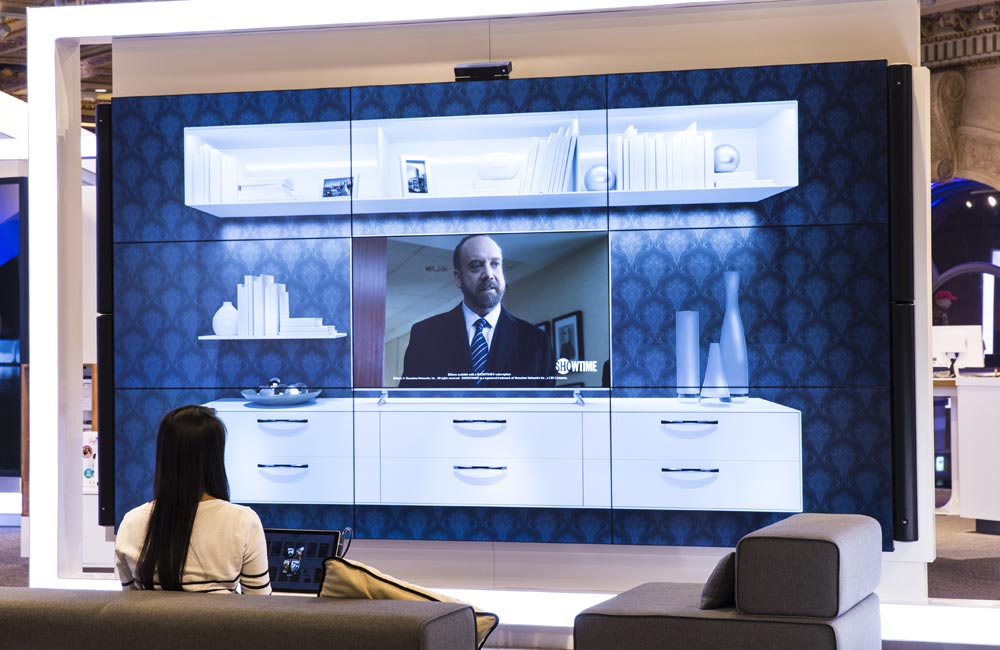
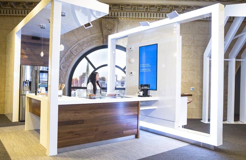
Home is the hub of a Connected Life – so a living room and kitchen welcome you into the space. Six multi-screen experience zones use video and proximity sensors to invite consumers to engage. Simple, intuitive UI lets users opt-in to view DIRECTV content or short :15 to :45 second animations on topics of interest. In the multi-media kitchen, consumer insights focused storytelling on three benefits: to make life easier, solve problems and do amazing things.
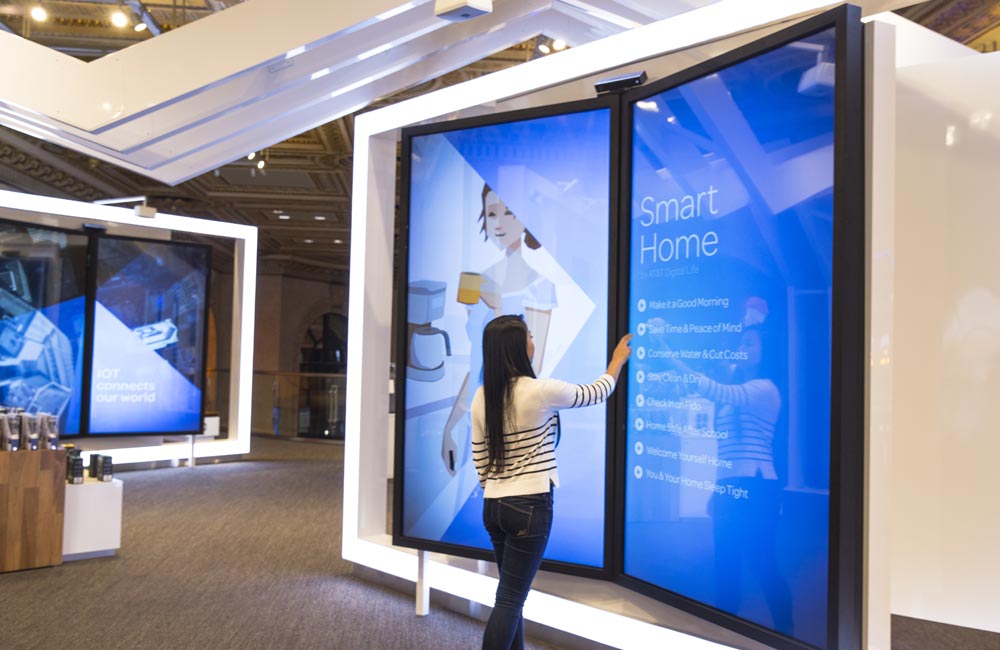
Two over-sized, touch-enabled storybooks explore the high-level benefits of an automated home and the smart city of the future. Technology solutions are improving security, efficiencies, staffing, traffic flow, parking and more.
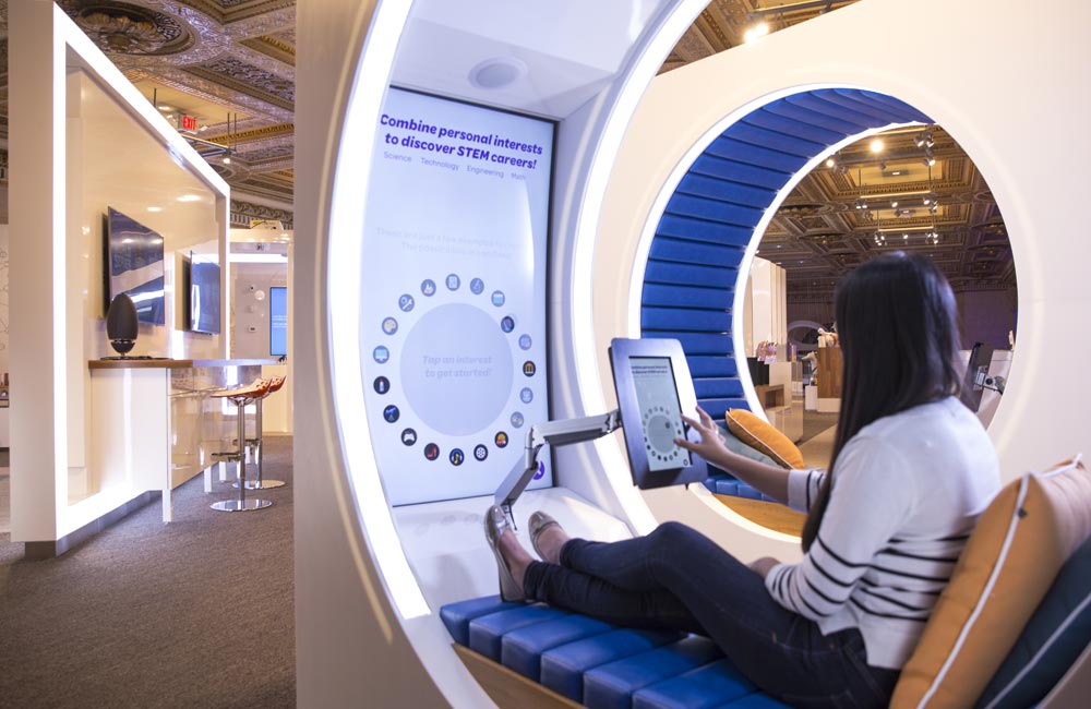
Two multi-media pods provide additional videos, infographics and custom games on AT&T community initiatives. In all, more than 100 pieces of original content were created and programmed to tell the Connected Life story. AT&T Brand Ambassadors report dwell times of 7-12 minutes per experience with consumers sharing surprise and delight about learning something new about AT&T and their role in the IOT movement.

Absolut Elyx Campaign
Introducing the first luxury vodka, meant to drink neat.
Vodka is typically defined as neutral – making it popular in mixed drinks. The introduction of Absolut Elyx, the world’s first single estate luxury vodka, required a shift in perception. In addition, the high-end pour was only available at exclusive bars and upscale restaurants in select cities. We developed a positionoing and messaging strategy to reach young, affluent jet-setters – drawing them in with the hand-crafted copper distillation process.
Banner ads and a rich-media video ran on Condé Nast websites including Vanity Fair, Style and Details.
To attract young affluents at CES in Las Vegas, we created bus wraps with copper and reflective vinyl to shimmer in the glow of the strip. Content was created for a 3-panel video wall and digital billboard at various locations around the city.
We developed a microsite – findelyx.com – where consumers were directed to distributors of the limited-availability spirit in their city, and given location specific cocktail recipes to reward their curiosity.
Shop! In-Store Communications Award: Gold
Individual Element: AT&T 1 Powell
A multi-screen experience zone at AT&T’s San Francisco flagship educated and inspired visitors about the possibilities of IOT technology. We were recognized for both the design of the space and the content it presented.

COLE HAAN POP-UP CUSTOMIZATION
STEERING REAL-TIME CUSTOMIZATION AT RETAIL
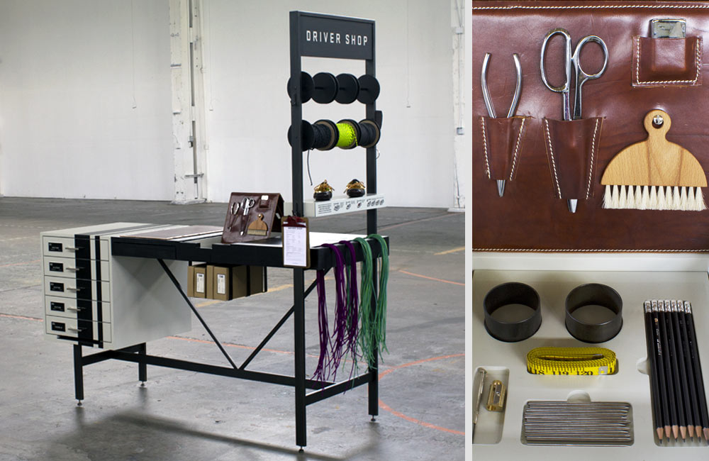
Cole Haan was looking to provide customization of the popular Driver Shoe silhouette at retail. The process would need to be simple and engaging for the consumer, all in a compact footprint.
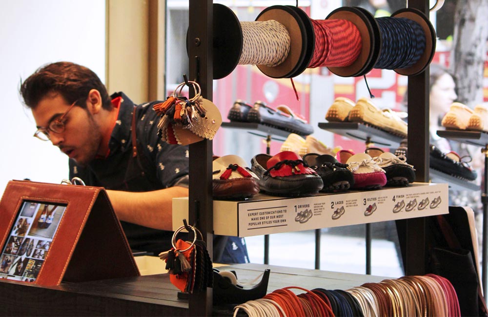
Customization is about choice, so the pop-up experience would need to educate consumers on their options. An app was created for shoppers to view design inspiration and a staff member was on-site to assemble each personalized pair. Specialized tools fit inside the table for easy access and quick clean-up when not in use.

BREVILLE SOCIAL CAMPAIGN & GIFT GUIDE
HOLIDAY TRADITIONS CONNECT PEOPLE AND PRODUCTS
The holidays are a season of giving! Our assignment was to create a social campaign that pushed to Breville’s first ever online Gift Guide.
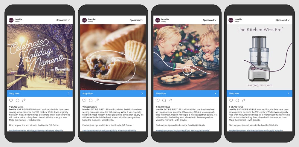
The focus was to “Celebrate Holiday Moments” around the world with good people and great food. Animations drew connections between locations, dishes, lifestyle moments, and product – amplifying and celebrating global holiday traditions.
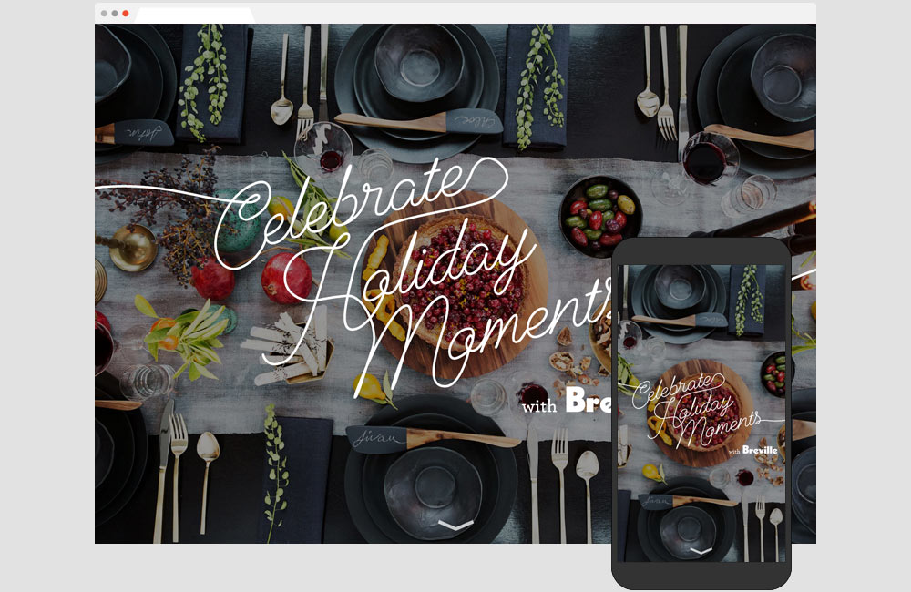
You don’t have to be a chef to appreciate the power and precision of Breville products. To help shoppers identify gift ideas for people on their list, products were grouped into categories like: the Perfect Host, Caffeine-Obsessed, Health Nut and more.
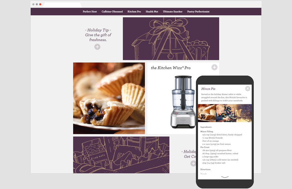
In the tradition of giving, we shared more than product photos. A simple click expands an image to include a traditional holiday recipe, creative gift wrapping ideas or a detailed product description.

AT&T INTERACTIVE WINDOW
PUT YOUR OWN TOUCH ON VAN GOGH’S FAMOUS WORK
Van Gogh’s three versions of the painting ‘Bedroom at Arles’ were brought together for the first time in North America at the Art Institute of Chicago. This unprecedented union was chosen as the subject for Project Windows 2016 – a design contest for retailers on Michigan Ave. While each painting has slightly varying versions of the setting, the most impactful difference is the drastically changing expression of color from one painting to the other. We focused in on this attribute to create an interactive window, allowing passersby to touch the glass and change the colorscape of various elements of the iconic painting. The AT&T window won in three categories: People’s Choice Award, Art Institute Award, and Most Interactive Award.
GOLD A•R•E• AWARD
EXPERIENTIAL AREA IN RETAIL DESIGN: AT&T JOURNEY OF INNOVATION
Utilizing over 600 pieces of archival video, 137 years of documents, and countless artifacts, the Journey of Innovation leads visitors down an unparalleled path of exploration. The space features many interactive and award winning components, including a massive installation of the first words ever uttered through a telephone from Alexander Graham Bell to his assistant, “Come here, I want you.” We developed a series of interactive experiences to entertain and educate consumers about AT&T’s longest standing commitment – innovating for human progress. Through infographics, interactive 3D photography, and gaming, we dove deep into disaster relief, distracted driving prevention, crowdsourced innovation, education reform, and women in tech.

Nordstrom x Nike Takeover
An ode to Air Max.
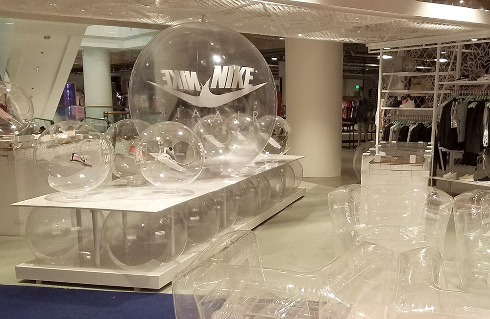
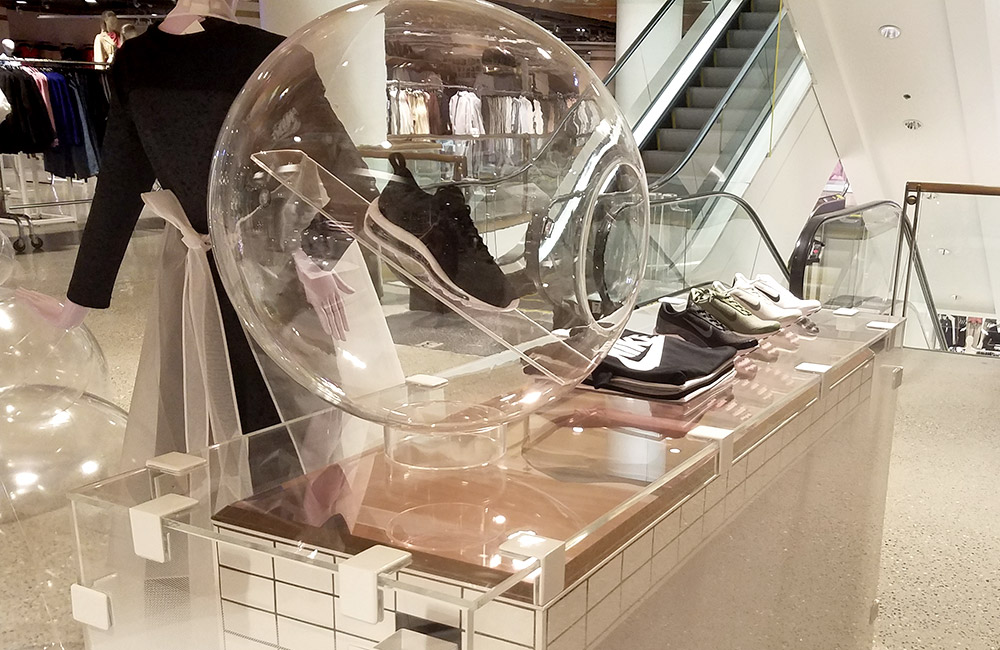
In 2017, Nike celebrated 30 years of the iconic Air Max shoe at select Nordstrom locations in Chicago, Vancouver, Toronto and the Seattle flagship. A week-long retail takeover brought the concept of air to life, inside and outside the store. Creative merged the technology behind the Air Max, with the style statements made by those who wear the iconic shoe. The entire initiative took just four weeks from the initial kick-off meeting – through strategy, creative, production and installation in four cities, all on the same night. Images were shared across social channels with tags: #nordstromxnike #nikeairmax.
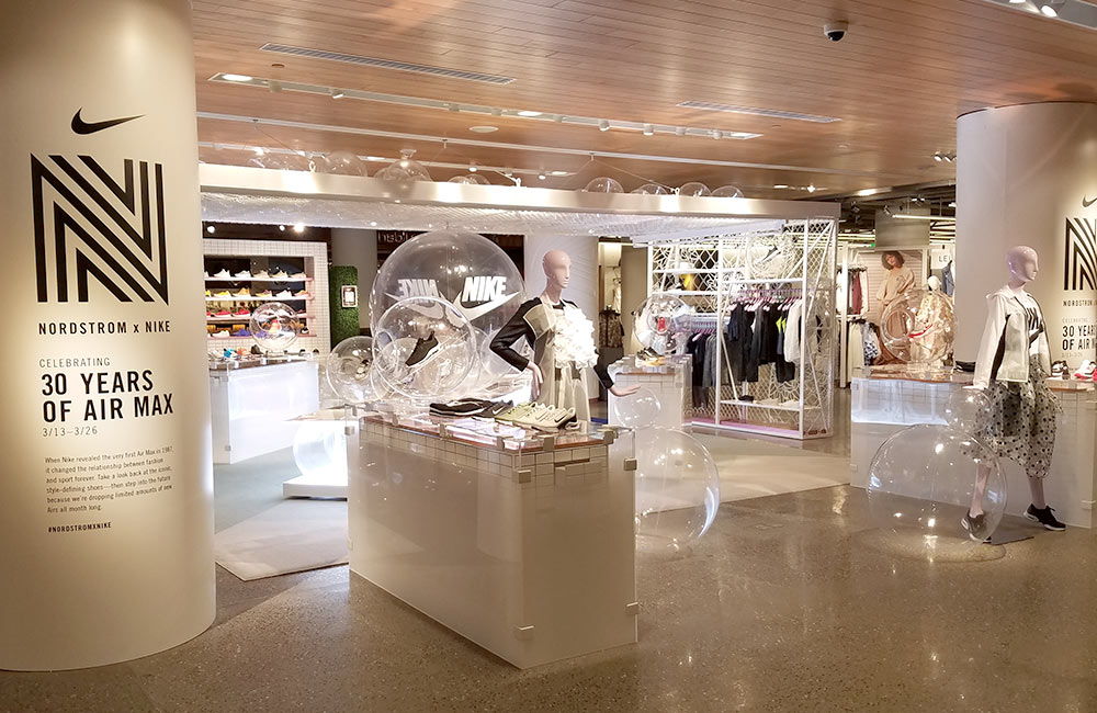
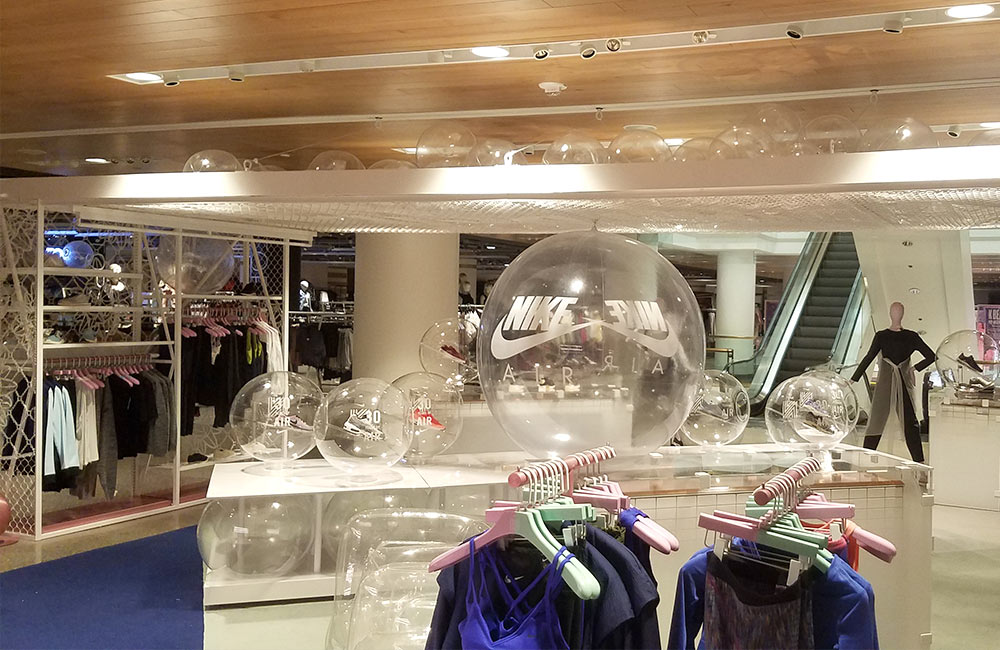
Northwest Regional ADDY Award: Gold
ABSOLUT ELYX LAS VEGAS STRIP LAUNCH
New work for Absolut Elyx hit the Vegas strip during CES in January. A digital billboard, 4-panel video wall and bus wraps raised awareness for the single-estate luxury vodka – available at high-end clubs in Sin City. An interactive campaign is also running on Conde Nast websites – pushing to a custom microsite.
Northwest Regional ADDY Award: Gold
GIANT JENGA
As part of an event, an oversized, 4-foot tall Jenga game was created and etched with information about our work and our clients. We tied prizes to certain bricks so even when the tower fell, participants left happy.

Wildlife Blocks Identity & Website
Artful, industrial space beckons PDX creative community
Casual, creative, communal – these words describe Portland and the new identity and website for the hyper-local Wildlife Blocks in Northeast PDX. Designed to differentiate from traditional office space – the work embraces an authentic Pacific Northwest vibe.
The identity system includes two buildings and adjacent parking space with leasing information for each available space.
A culture of creativity is shared by the tenants of the Wildlife Blocks – with links to each company’s website and a list of neighborhood haunts for shopping, dining and entertainment.

MALIBU CAMPAIGN
MALIBU LAUNCHES NEW GRAB-N-GO CANS WITH A SOCIAL FOCUS
Malibu was entering a new category with their first ready-to-drink offering that would merchandise on the beer aisle. We develop a positioning strategy and creative campaign with multiple entry points to raise awareness and induce trail in consumer markets.
We created a social gaming platform powered by Instagram – called the Official State of Summer. We asked people to post pictures of summer in their state with #malibucans #yourstate (e.g. #iowa) for a chance to win weekly prizes and help their home turf earn the title: Official State of Summer.
We took over Malibu’s social channels, posting to incentivize gameplay with weekly prizes and involved followers via retweets and Instagram comments to boost engagement. All entries were aggregated on a custom site – officialstateofsummer.com – where consumers could search images by State, Leaderboard, and likes. We created custom video content and downloadable ringtones for sharing.
Event activations at Spring Break in Panama City and Lake Havasu raised awareness and promoted game play with poolside drink samples swag – including a pair of bracelets with a note to keep one, and give one to a friend.
Several different states were in the running, including Alaska for a full week. In the end, sunny CA was named the Official State of Summer. The website transformed to celebrate all things California – including photo entries, Instagram player profiles and a list of favorite beaches, outdoor adventures, concert venues, watering holes and more.

Big Brothers Big Sisters Campaign
Calling a community to action: It’s Big Time.
Education is a global crisis – affecting not only the future of our children, but the economic and social stability of our communities and our world. That’s why we got involved with Big Brothers Big Sisters. When a child has a positive adult influence in their lives, they get the support, advise and encouragement they need to reach their full potential.

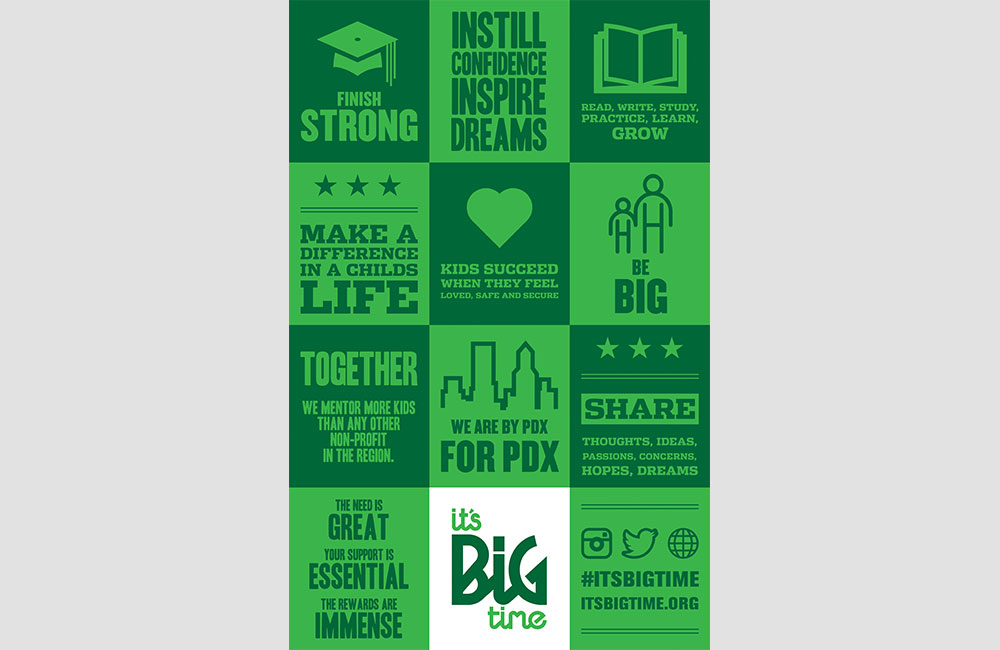
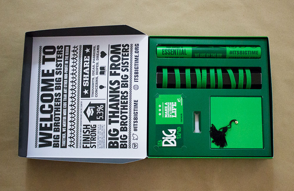
We did a deep dive with research, strategy and positioning. Creative focused on raising awareness and funds; and helping to recruit volunteer BIGS with the rally cry: It’s Big Time. A small business kit encouraged local companies to pledge an annual gift. Local banks and grocery stores solicited $1 donations from the public and posted graduation caps to show progress.
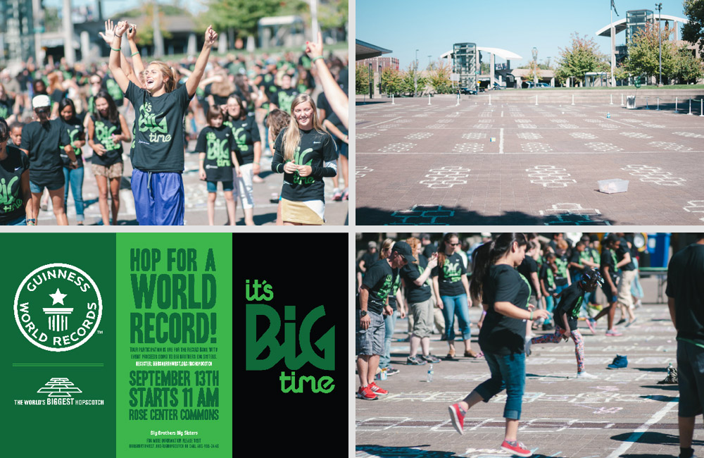
The response was BIG TIME. What could be bigger? The Hopscotch World Record. We created an event for BIGS, KIDS, and hundreds of community members to hop into the record books, onto local news coverage and across social media.
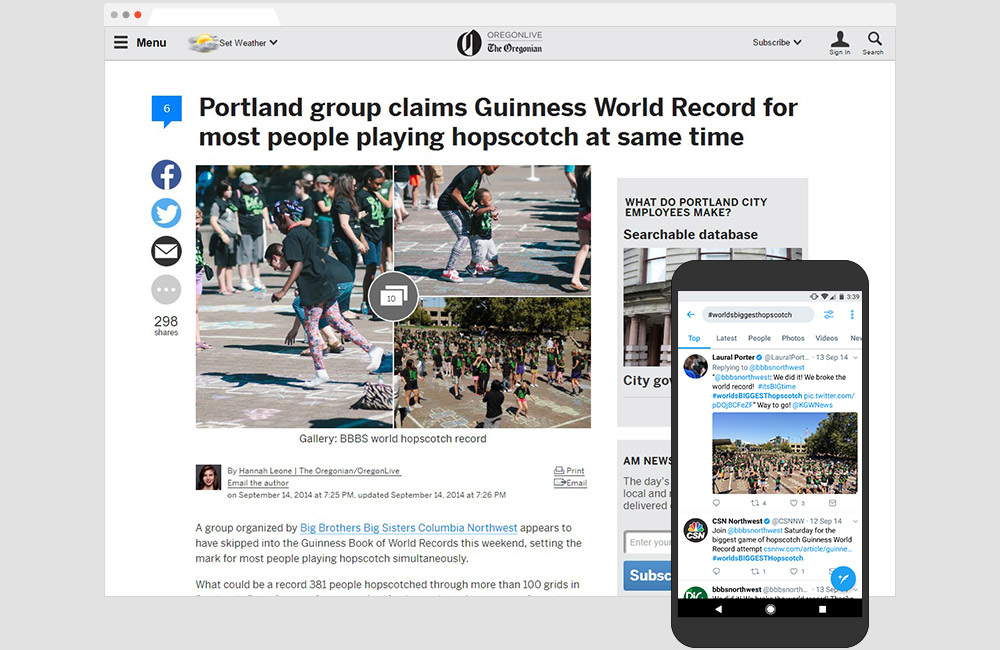
Northwest Regional ADDY Award: Silver
Retail: AT&T 1 Powell
Acknowledging the best in the advertising industry, the ADDY’s are the largest and most representative competition nationally. Our work for AT&T’s San Francisco flagship was recognized at the regional level for game changing design at retail.

The Art of Shaving Activation
Drawing a crowd for the launch of the Chelsea Collection.
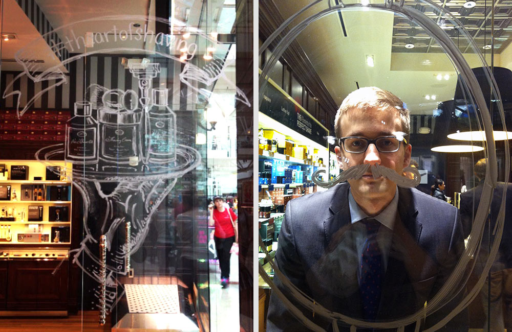
To build hype for the launch of the Chelsea Collection – the first razor, brush and stand made exclusively by The Art of Shaving – we created activations in New York, Boston, Miami, Seattle, San Francisco and other major cities.

Artists used retail windows as a transparent canvas – illustrating scenes from inside the store. The live illustrations drew shoppers inside, where they were greeted with a hot towel, the first step in a perfect shave. Experts were on hand to personalize interactions based on an individual’s skin type, hairstyle and grooming routine.

NIKE POP-UP
NIKE ENERGY EVENT LIGHTS UP NBA ALL-STAR WEEKEND
Hype was generated for weeks and the Nike All-Star energy event delivered. Four domes lit up the night sky at the legendary corner of Hollywood and Vine with tributes to the game, its players, and loyal followers. Surface projections mapped Kobe Bryant’s highly anticipated feature film, “The Black Mamba.”
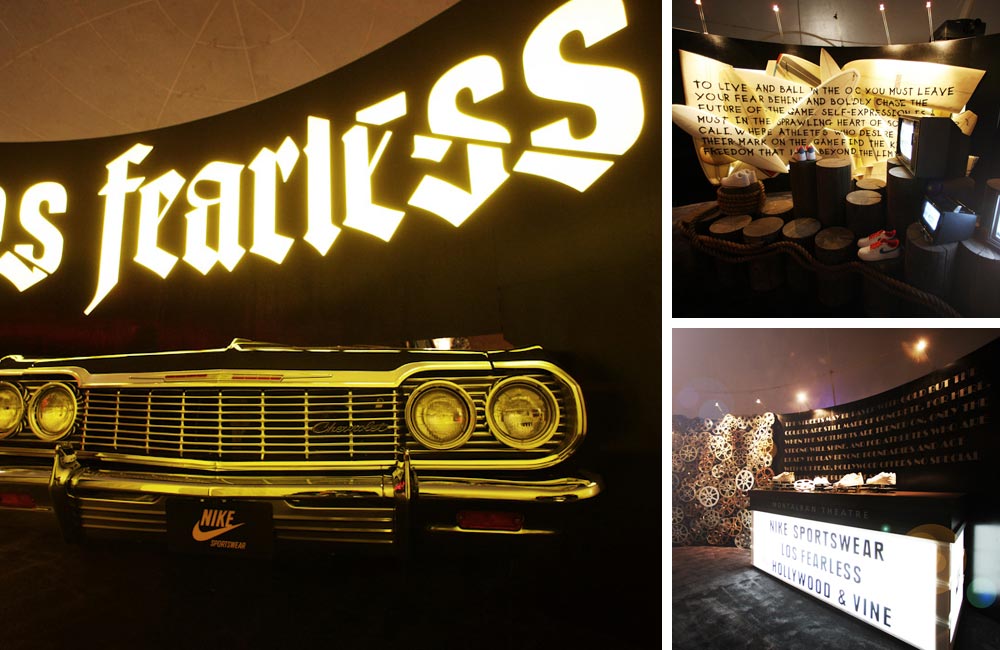
Three distinct areas were inspired by local neighborhoods; the streets of East LA, the surf culture of Orange County, and the glitz of Hollywood. Immersive experiences entertained onlookers while sharing stories of the game.
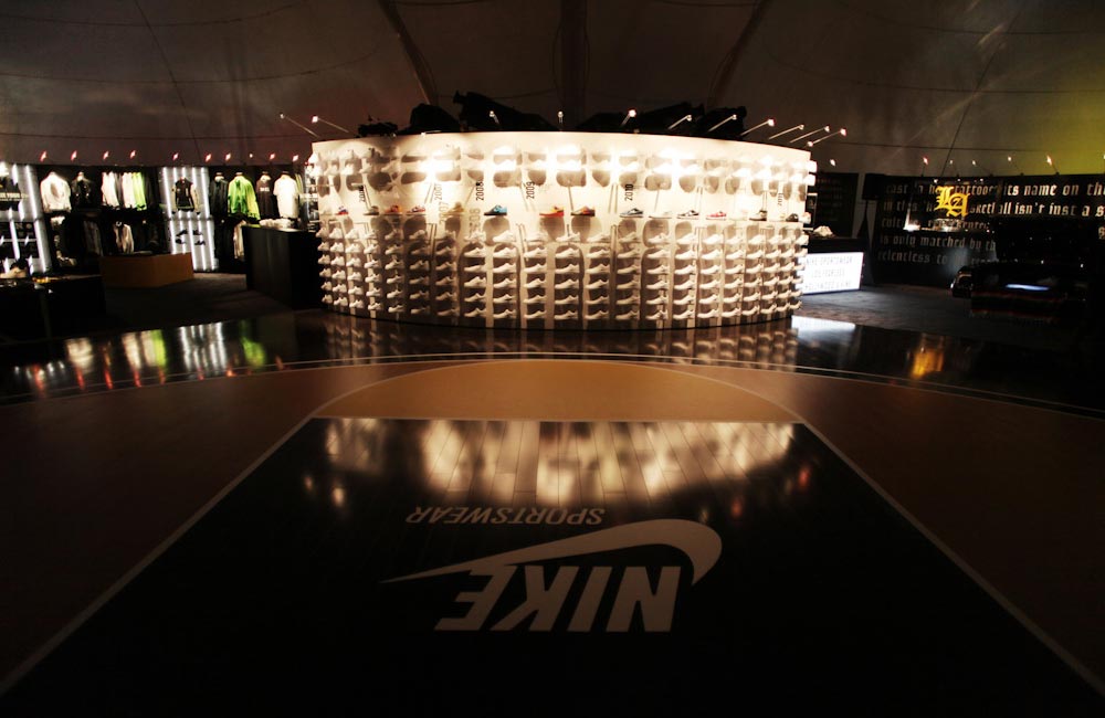
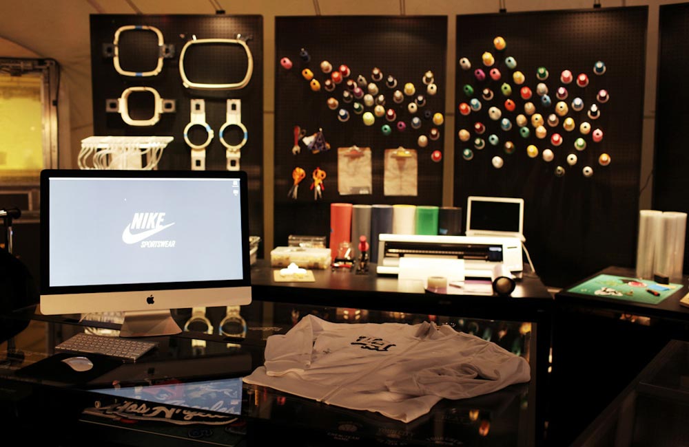
Deeper into the space, the new Kobe 6 was showcased on a wall surrounded by each individual Air Force One style to see play during an All-Star game. Placed adjacently was a retail customization zone where consumers could make Nike product their own.
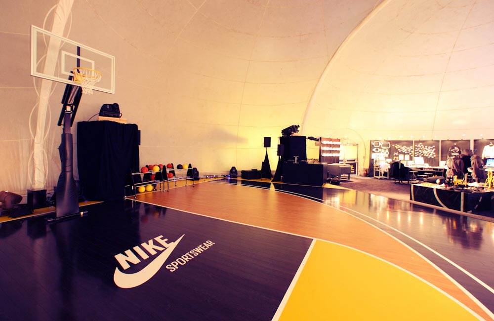
The final experience zone was a half-court where the hoops were hot with 3-point and slam dunk competitions. At the top of the key was an ode to Nike and the styles that saw hardwood.
The space was hailed as "one of the biggest events off the court" generating media coverage and social engagement for weeks following the games.

Nike Product Launch
Kicking a new ball to soccer fanatics in South America.
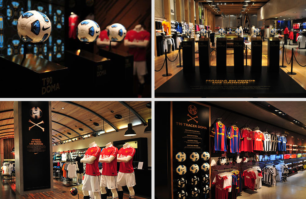
On any surface, in any weather, in any barrio – the Nike T90 Tracer Doma is said to be the world’s most deadly accurate soccer ball. Few can appreciate it like the athletes and fans of South America where soccer borders on religion. Nike put the T90 Tracer Doma in play as the official ball of the Copa Barrio (Neighborhood Cup) tournament.
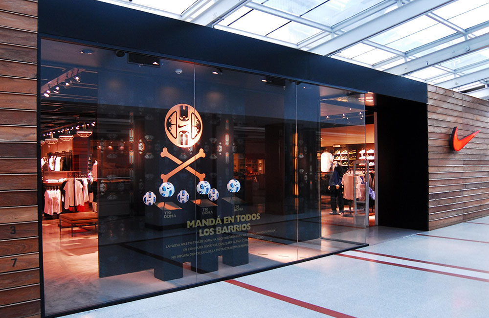
We built a retail program to highlight product technology and design. The take-over included dedicated floor space, pedestals and light boxes reflecting the pattern on the ball. The program commanded attention in windows and storefronts, and scaled to suit retail footprints. Today, the T90 Tracer Doma can be seen in neighborhoods across the continent.
Shop! In-Store Communications Award: Gold
Individual Element: AT&T 1 Powell
A multi-screen experience zone at AT&T’s San Francisco flagship educated and inspired visitors about the possibilities of IOT technology. We were recognized for both the design of the space and the content it presented.

Starbucks Strategy
Create a local consumer experience for a global retail network.
Starbucks is a mega-brand with thousands of locations around the world. Yet they offer one of the most personalized products on the market. Drink customization varies widely by size, number of shots, flavors, types of milk, hot or iced, and so on.
Despite its global brand status, Starbucks was looking to recapture the intimacy of a local coffee house. It’s where the brand started back when they were just a few cafés in Seattle. How could a brand experiencing massive growth provide a more personalized experience with a consistently great cup of coffee?
We provided strategic insights on culture and consumer behavior, then created a programming framework for each space. This allowed Starbucks stores, located just blocks from each other, to be viewed as individual cafés with different personalities that appeal to their consumers – without changing the architecture or retail footprint.
We find inspiration everywhere. Always curating. Layering information and ideas. Having access to what we love at all times is true freedom. It makes the work – if you call it that – better. Our culture is the magic. It’s not for everyone, and we’re good with that.
At Twenty Four 7, our mission is to celebrate the passions that drive each of us 24 hours a day, 7 days a week. We created the Quarter Note as a seasonal, curated collection of some of our favorites, all in the city that we love – Portland.


